Panther Portal: Making Class Registration Clear, Simple, and Modern
As part of a four-member design team, I helped create Panther Portal, a user-centered course registration prototype for the University of Northern Iowa. Our goal was to transform a confusing, outdated system into a modern, intuitive experience rooted in direct student feedback.
In my role, I acted as a synthesizer, presenter, and Adobe XD designer — streamlining research insights into actionable design elements, pitching key concepts to stakeholders, and developing the interactive prototype that showcased our vision.

Process
1. Research & Discovery
The first thing I did was talk directly to students about their frustrations with the current “Student Center.” Those interviews gave me real stories to work with — students felt lost, the search process was clunky, and there was no clear way to track progress toward graduation. To capture what I was hearing, I built out personas, mapped customer journeys, and created concept models. This step helped me frame the problem in a way that connected student needs to design opportunities.
3. Prototyping & Testing
Once we had a solid foundation, I developed a working prototype in Adobe XD. I ran usability tests with students and watched closely how they moved through the system. Their feedback drove several refinements — like making the degree progress tracker more visual and simplifying the plan of study. Testing was essential; it helped me make sure the final design wasn’t just clean but also truly solved the problems students had called out.
2. Design & Ideation
From there, I moved into design. I used goal-directed design principles and design thinking to brainstorm solutions with my team. My focus was turning feedback into practical ideas. I sketched layouts, built wireframes in Adobe XD, and kept the flow simple and consistent. Each iteration was about making navigation faster and reducing the confusion students described in our interviews.
A few key issues stood out:
Clunky Navigation – students struggled to find what they needed without clicking through endless menus.
No Clear Progress Tracking – there was no way to easily see degree progress or plan ahead.
Limited Support for New Students – first-time users often felt lost, with no guidance on where to start.
The problem from the current system
When I interviewed students, the message was consistent: the current “Student Center” system was confusing and inefficient. Everything felt buried — the homepage acted like a dumping ground, and the class search tool required multiple steps that frustrated students.
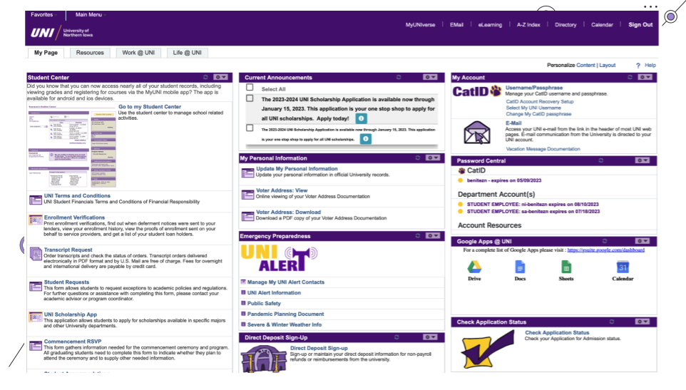

Student Center


Old Version
To address those issues, I worked with my team to design a new system we called Panther Portal. Every feature we built came directly from what students told us they needed.
Some of the key updates I designed and tested included:
Graduation Progress Tracker – a clear, visual tool that let students instantly see how far along they were in their degree.
Plan of Study – a personalized roadmap showing completed courses and what still needed to be taken, helping students plan ahead with less guesswork.
Student Organization Discovery Tool – a feature that matched students with campus orgs based on their schedule, making it easier to get involved without extra stress.
Solution
These updates simplified navigation, reduced confusion, and modernized the overall experience. Instead of feeling like a maze, the system became a guide — something that helped students move forward confidently instead of holding them back.
For me, the outcome was more than just a polished interface. It was proof that by listening to users and iterating based on their needs, it’s possible to transform a process that once felt overwhelming into one that feels supportive and intuitive.